The Ebates Home Page
The Ebates home page was the last key page that we redesigned. Several changes in the page structure were A/B tested before moving forward with the more dramatic transformation of the entire page.
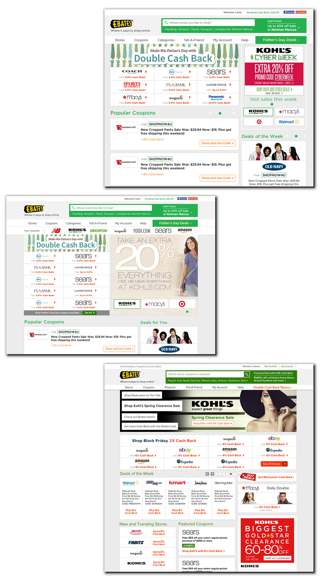
Beginning with Weekly Promotions
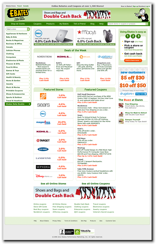
The central display of weekly promotions was the first home page feature that was tested. By moving to a grid display of stores, we increased revenue by 300% and reduced the overhead of creating custom graphics.
The older page displayed the weekly promotions in two modules in the center top of the home page. Each store had to have a custom graphic created and the deals rotated.
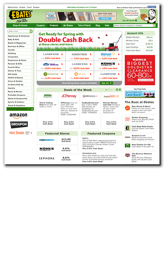
The Updated page displayed the weekly promotion in a grid and required no custom graphics.
Header Evolution
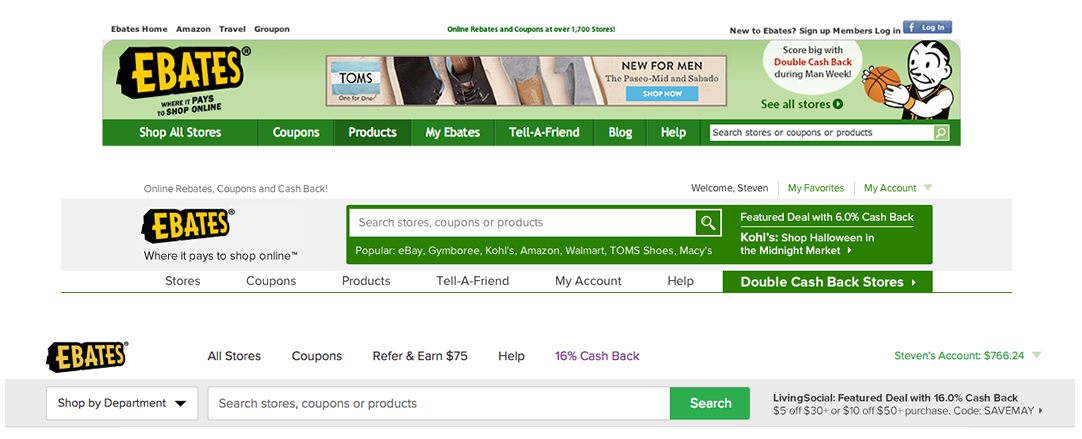
An updated page header moved search to a more prominent position and improved merchant discoverability. The header simplified as it evolved. Each change was confirmed with A/B testing.
Responsive Explorations
A responsive page design was considered. Ebates had already invested in a robust suite of Apps as well as a mobile site for smart phones and tablets.
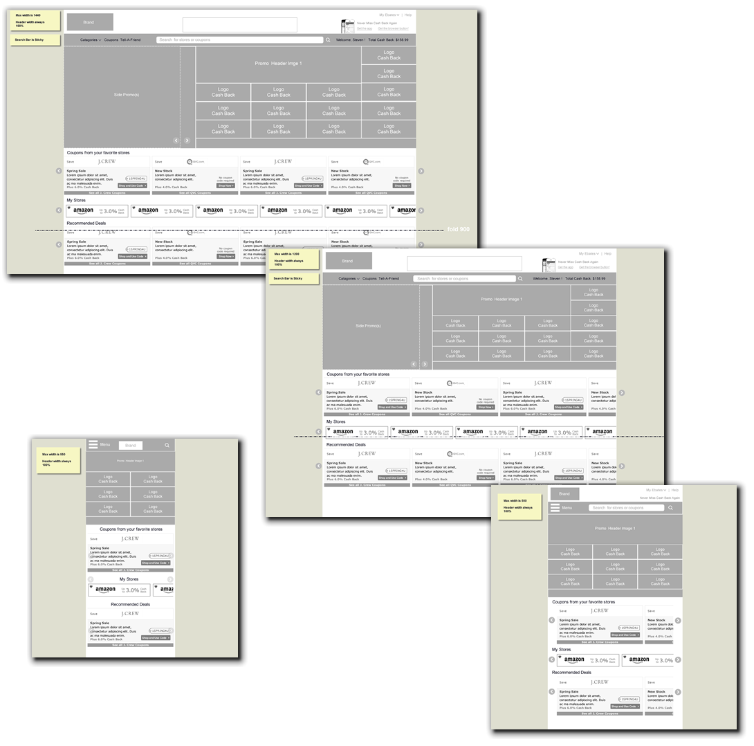
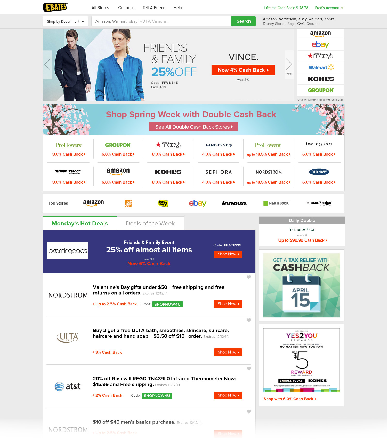
Wider Pages for More Content
Instead of a responsive site, the decision was made to create a wider home page that could support a carousel.

Several approaches were explored before we moved forward with a version with a carousel on top and and merchant grid below.
A Collaboration
The current home page is a product of the whole team. Erin Dang helped design the Ice Cream visual Style and Kihong Kim was responsible for the final visual treatment of the home page and header.